U.S. News College Profiles


Every year, prospective college students come to the U.S. News Education site to research their college options. This is how I redesigned the college profile pages to help improve user experience and increase lead generation for institutions. 


Frame 10 (1).png

Overview

Problem
The existing college profile pages posed a significant usability challenge for users, hindered by an overwhelming amount of information and low aesthetic appeal. This not only impeded information absorption but also failed to align with the business objective of generating more leads through these pages.

Team
Product Designer (Me), Product Owner, Product Analyst, Developer

Tools
Sketch, Invision, Miro, Jira

Dates
Jan 2022


BACKGROUND

Reasons behind the redesign

A shift in business strategy
Existing college profiles were designed for maximizing ad impressions and sales of our paid account experience. The new profiles should be designed for maximizing “indications of interest” (lead generation).

Page usability was lacking
The purpose of the college profiles is for students to find the information they need to decide whether a particular school is a good fit for them. Our hypothesis was that the pages were so overloaded with data, that it was hard for students to find the information they needed to evaluate program fit.

Screenshots from the existing college profile page

DISCOVERY & RESEARCH

Identifying specific areas for improvement

Secondary research provided by product owner

The product team provided some preliminary research on what students look for when evaluating college fit. They found that students ask these core questions when evaluating college fit:

 
  • Can I get in?

  • Can I afford it?

  • Will I fit in?

  • Is it safe?

  • Will it be fun?

  • How do I enroll?

  • Will it get me where I want to go?

  • Is it in a good location?

Discovering user pain points through user tests

I then worked with a product analyst to set up user tests on the existing college profiles, with the goal of answering the following:

  • How do users like the U.S. News college profiles compared to our competitors’ profiles?

  • Do our college profiles help users evaluate if a school is a good fit for them?

  • How well can users navigate our profile pages?

See key findings below.

 
Frame 10 (1).png

IDEATION

Lots to consider on a giant page

How might we organize and display data?

The product owner created a list of data to include on the page, sorted into sections. I ideated on ways to display the data that prioritized the most important information (according to users), so that users could easily find what they were looking for.

How might we help students evaluate fit?

Users mentioned wanting to see more photos of the campuses. We had a large photo gallery component that we used on other parts of the site, and I thought this would be the perfect place to reuse that component.

We also thought it would be helpful to add more campus life information to help students answer the question of, “Will I fit in?”

How might we make the page easier to navigate?

Because these pages were so long, users often scrolled past what they were looking for and had trouble finding what they needed. Thankfully, we had recently created designs for Private School profiles that solved this problem. It utilized a vertical navigation with anchor links to allow users to jump to different sections of the page.


A few sketches of ideas for how to organize data on the page. Pen and paper are my favorite tools for ideation!

DESIGN PROCESS

Exploring ideas

Making the most our of our design system

One of the constraints for this redesign was staying within our design system. It was challenging to figure out how to do that while also trying to make the page look lighter and fresher than the typical U.S. News brand. During my exploration of this, I tried mixing and matching components and trying out lighter colors. Here are some of my explorations that didn’t make the cut.

Navigation constraints

Thinking through the navigation was another challenge. The existing profile architecture was set up in a horizontal navigation/tab structure, with an Overview page (the page I was redesigning), and “Interior” pages (detailed pages about each section of the overview page).

I wanted to utilize a vertical navigation with anchor links on the Overview page, which meant removing the tab navigation - but how would users access the Interior pages?

I came up with a solution where each section of the Overview would contain a link to its corresponding Interior page, and each Interior page would have a back button to return to the Overview. Spoiler alert: this idea was wildly unsuccessful.


FINAL DESIGNS

Data at a glance

One of the main goals of the redesign was to make the profiles more digestible to users. Previously, most of the data appeared in paragraph format followed by data rows, which proved to be difficult to parse.

For the new designs, I highlighted the most important data points in a bordered box, which allowed users to compartmentalize the information, and guided their attention effectively, making it easier for them to find specific data points.

This styling lightened up the page and the “box with label” component turned out to be flexible enough to be used across many areas of the site.


Helping students evaluate fit

To help students get a better of idea of whether or not the school would be a good fit, we added:

  1. More photos to the top of the page

  2. Graphs for gender distribution and ethnic diversity

  3. A “Campus Life” section (an MVP of this using readily available data)


Improved navigation

After encountering some road bumps with the navigation, we decided to keep the current horizontal/tab navigation structure, but have it stick to the top of the page when a user scrolls.

Previously, the navigation on Interior pages was placed below a header section, which made it awkward to switch between pages. Users were often disoriented after clicking to an Interior page. For the redesign, I placed the navigation above the page header on Interior pages, so that it would look more like a connecting thread between all of the pages.

I also added the “Save” button to the sticky header so that it would always be accessible (and increase lead gen)!

 
Screenshot 2024-01-08 at 10.24.39 PM.png

CONCLUSION

Hand-off to development

Once my designs were approved, I set up a handoff meeting to explain the designs and functionality to the engineering team. I worked closely with developers throughout the development process, answering questions as they came up and doing multiple rounds of QA tests.

Because this was such a big project, our usual Jira comment feedback got a little chaotic - instead, we documented feedback in a Google doc, which made things simpler for the developer.

Learnings

What I would do differently next time

Unfortunately, we did not have the time or resources to conduct usability tests on the new designs before launching. If I had more time, I would have loved to make sure that users could navigate the page more easily than before.

Results

Since launching the new pages, we have run a few user tests on them and have received much improved feedback about the look and feel of the page, as well as increased comprehension of the page content.

In the month following the launch, college profile page sessions increased by 17% and leads generated by the Save button increased by 150% year over year!

Next steps for the profiles

Following the success of the college profile redesign, the product team wanted to implement similar updates to the grad school profiles.

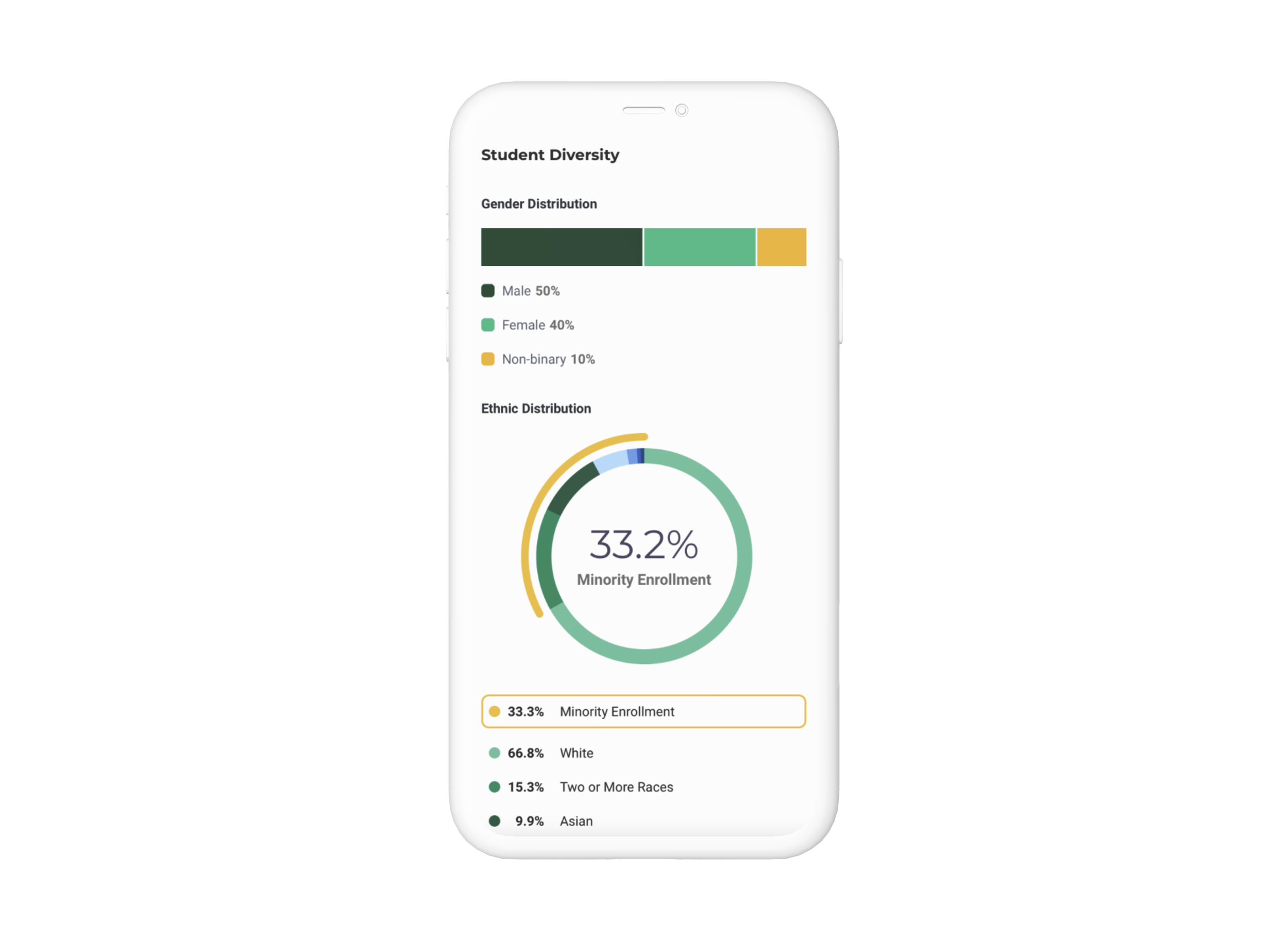
For the college profiles themselves, the team is always thinking of new ways to make the profiles valuable to users. Because of the redesign, there is now more flexibility to add data to the Overview pages without overcrowding them, allowing for more ideas to bloom.