U.S. News Hotel Search Redesign


The U.S. News hotel search pages serve as a trusted source for hotel rankings, aiming to help users make informed decisions when choosing accommodations. This is how we updated these pages, enhancing user understanding of the site’s value proposition, while navigating conflicting business goals.


Dates
May 2023

Role
Lead Product Designer

Tools
Figma, Jira

 
Frame 10 (1).png

BACKGROUND

Pages in need of a facelift

U.S. News's hotel search pages hadn't been updated in years, and user feedback reflected opportunities for improvement:

  • Users frequently found that the hotel search pages felt bland, lacked personality, and didn't give them a reason to return

  • Many users didn't understand the purpose of the pages, especially since they can’t book directly from the site. They questioned why they should use U.S. News over more well-known travel sites like Booking.com

Our challenge was to give the hotel search a fresh look and highlight the value of using it as a decision-making resource, while retaining clicks to partner sites.


pic of before

〰️

pic of before 〰️

Screenshots from the existing college profile page


Design goals

The redesign aimed to:

  • Modernize the Interface: Update the visual design to create a more appealing and travel-esque user experience while staying within brand constraints

  • Clarify Value Proposition: Communicate USN’s unique value, such as editorial insights and rankings, to differentiate from competitors

  • Balance User Needs and Business Goals: Maintain click-through rates to partner sites while ensuring we were still “helping users make the best decisions” for them (U.S. News’s mission)


UPDATE 1 OF 3

Redesigning the hotel cards

I began by tackling the hotel cards, the most critical element where users decide whether or not to click through to partner sites. I reformatted the card so that its layout would align with more common card design patterns. Other notable updates included:

  1. Creating a scrollable photo gallery for users to browse (users mentioned photos as one of their key decision-making factors)

  2. Adding an editorial blurb for each hotel that highlights its strengths and unique features. Since U.S. News is a media brand with a wealth of editorial content, this was an opportunity to differentiate from competitors like Booking.com by offering a unique, expert voice

picture of new card

〰️

picture of new card 〰️

Users preferred the new card design

In user testing, participants responded positively to new card designs and appreciated the additional information from the editorial blurb.

User testing graphic

〰️

User testing graphic 〰️

Unexpected challenge

Upon A/B testing the new cards against the old, we found that the new cards received XXX% more engagement than the old ones! However, clicks to partner sites had reduced significantly. Because the new cards provided more information, users no longer needed to click blindly—they could gather enough information from the card itself to decide if the hotel was a fit, which sometimes meant not clicking the to the partner site at all.

 
Frame 5.png

UPDATE 2 of 3

Redesigning the hero

Another major update was the hero section of the page. Users found the old hero section to be “ugly,” “corporate,” and “bland”, especially when seen next to the new cards.

Based on this feedback, I redesigned the hero to feature more imagery and incorporated clear messaging about what users could get from the page - also calling out the editorial blurbs from the new cards. This redesign was well-received in testing, with users unanimously preferring it over the old version. They felt that the new hero gave the page more personality and made it easier to understand the purpose of the rankings.

old hero to new hero

〰️

old hero to new hero 〰️

UPDATE 3 of 3

Adding quick filters

As part of the broader redesign, we also introduced quick filters to improve usability and make the search experience more efficient. Previously, a section called “Related Rankings” sat at the top of the results page, but during user testing, it became clear that users were confused by these links—either ignoring them completely or clicking them, only to find they led to different ranking pages.

In response, the product team suggested replacing the related rankings section with quick filters, similar to what competitors were using. The idea was to help users more easily find hotels that fit their criteria, making the search experience faster and more relevant. This change aligned with U.S. News' mission of helping people make informed decisions and aimed to drive more clicks to partner sites. While this feature was more of a product-driven decision, it helped address user confusion and streamlined the page layout.

Related rankings to QF

〰️

Related rankings to QF 〰️

OUTCOMES

Outcomes: A Partial Launch

In the end, the redesigned hero section launched successfully, and feedback from users was overwhelmingly positive. It modernized the look of the page and helped clarify its purpose.

We also launched an MVP of a quick filter feature, which has received lots of user praise and engagement.

Unfortunately, the hotel card redesign was not launched, as the business decided that the drop in clicks outweighed the increased engagement. Despite this, the project provided valuable insights into how users interact with hotel ranking pages and how providing more information can sometimes reduce the need for a click.

link to site

〰️

link to site 〰️

KEY TAKEAWAYS

A Holistic Approach to User Experience and Conversion Funnels

Funnel Blindness

One key lesson from this project was the importance of looking at the entire user journey rather than fixating on a single metric. The product team was laser-focused on driving clicks on the card’s button, while other important conversion funnels, like the map view and hotel profile pages, were overlooked. Users don’t always follow a linear path to conversion, and optimizing one button doesn’t always lead to the best outcomes.

The Button Dilemma

At one point, I was asked to simply make the button larger to drive more clicks—an oversimplification of user behavior. While it might have driven more clicks initially, it wouldn’t have addressed the underlying issue of user intent. Instead, we should have looked more holistically at improving all touchpoints users interact with, not just the hotel card button.

Creative Problem-Solving

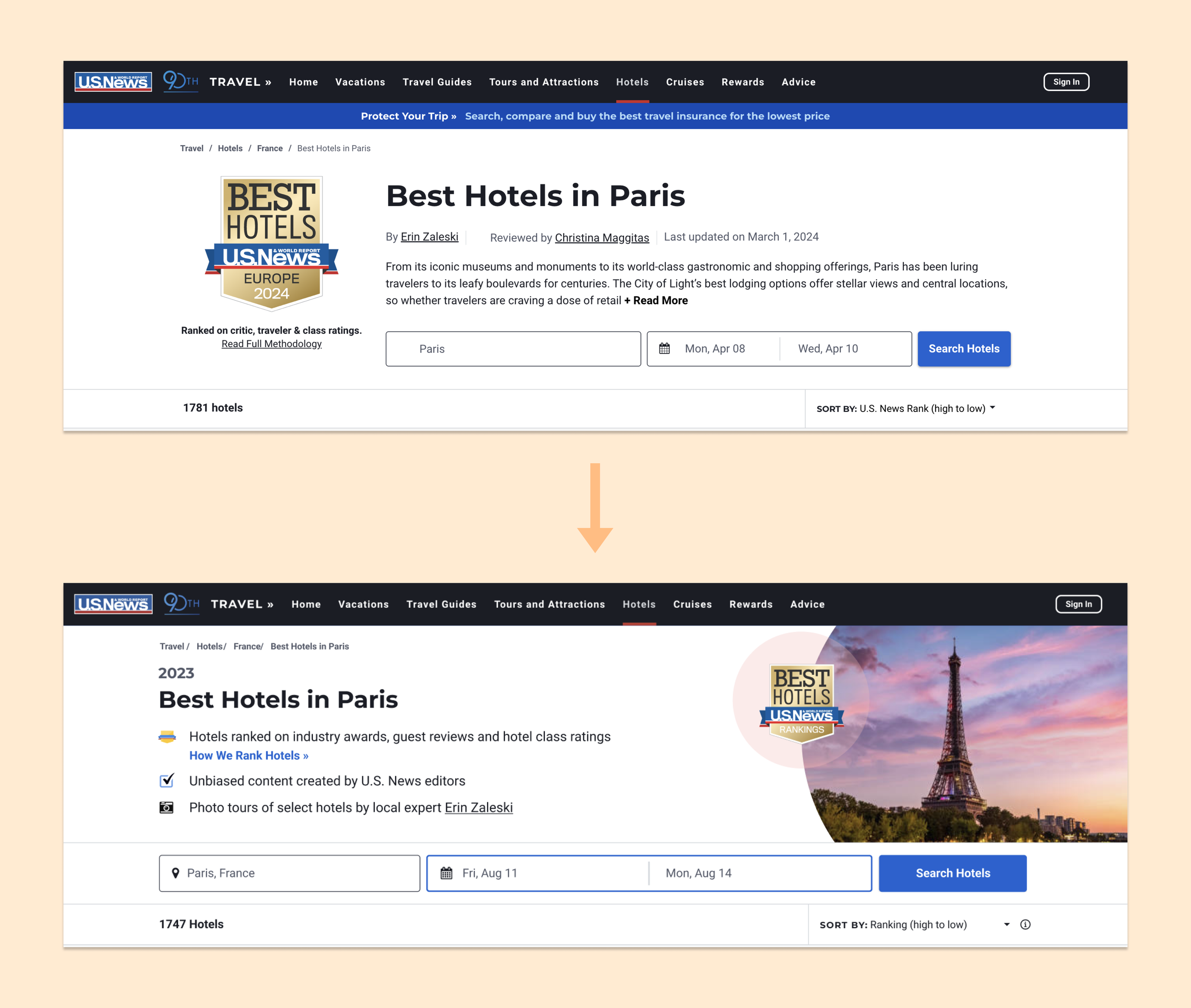
Despite the frustrations, this project also highlighted the importance of creative thinking. By leveraging U.S. News’s editorial content and redesigning the hero section, we were able to better differentiate ourselves from competitors like Booking.com. While the results weren’t perfect, the project offered a valuable lesson in balancing brand constraints, user preferences, and business goals.

Conclusion

While the final results were mixed, this project provided valuable insights into the balance between user experience and business objectives. I learned the importance of looking beyond surface-level fixes—like making buttons bigger—and thinking more holistically about how users interact with multiple parts of a page.